Jessica Conner recalls the moment she first walked into Mary-Michael Neese’s home vividly. “I saw it and thought, ‘Yes! This girl has cool taste,’” Jessica recalls. Around her she found on-trend acrylic chairs and funky glass light fixtures—the types of pieces she had been selecting for her own interior design projects.
Needless to say the styles of the interior designer and homeowner instantly were in sync. Mary-Michael had called in Jessica to help her reconfigure her family of six’s home to add a bathroom for her teenage son, move the laundry room and, the most fun part, update the kitchen.
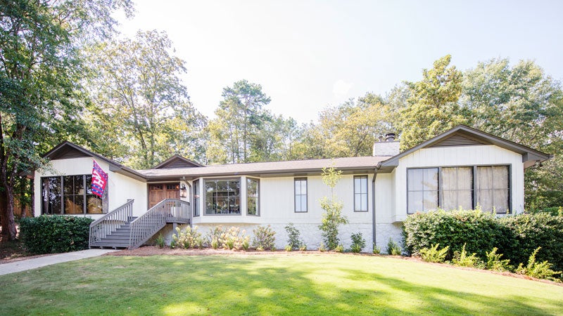 When the Neeses bought the Vestavia home in 2013, everything in it was original to its 1979 origins except for new granite countertops, but they saw a lot of potential in its good bones. They quickly brought in lighter paint inside and out. “We called it the big brown house,” Mary-Michael says. “Every square foot of it was dark brown. But I have enough vision to see past ugly.”
When it came time for more extensive renovations a few years later, Jessica and Mary-Michael started by looking for common themes on Mary-Michael’s Pinterest boards and then translated them into a cohesive design for the home. They painted the walls half strength Modern White and the trim and cabinets full strength of the same hue. The floors became a lighter hue as well with a whitewashed white oak hardwood.
They also added new mullion strips to the windows, which made them look like new windows to friends who came over, and added new molding, doors and casings throughout the house. “That was a dramatic upgrade that would have changed the look even if we didn’t do the kitchen,” Mary-Michael says.

Mary-Michael Neese with her husband, Ashley Neese, sit in their front yard with their kids Lucy, Lynlee and Lawson (their son Landon is not pictured).
But the biggest statement was in fact the kitchen. It was there that Jessica says they decided to “push the envelope” with a black hood and no wall cabinets, plus the statement lantern lights they hung above the island.
Mary-Michael ended up acting as the general contractor for all the renovations and was in the middle of the construction every day telling people what to do. “I definitely have the bug to renovate or build again,” she says. “I am the only person I know who actually enjoyed the process of renovating.” But she says she couldn’t have done with without Jessica: “Her designs are on point, her prices are reasonable, and her plans are very detailed—and were probably the sole reason the renovation was easy and enjoyable on my end.”
What Mary-Michael pulled off is spectacular, Jessica will tell you, and they both made a new friend along the way. Now Jessica’s next step is just to figure out how she can hire Mary-Michael to work with her on future client projects.
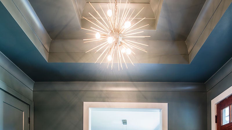 Foyer
Foyer
To make a dramatic statement when you enter the house, Mary-Michael came up with the idea to add a tray ceiling. The dark wall color contrasts with the white in most of the house, and a metallic modern fixture from World Market adds extra pizazz to the space.
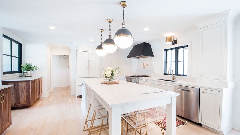 Kitchen
Jessica and Mary-Michael wanted to modern yet traditional look for the kitchen. They went practical with some features like durable quartz countertops while making style statements with the black vent hood and the quartz backsplash in place of upper cabinets. The Neeses also now have an island with enough chairs to seat their whole family—and a good looking one at that.
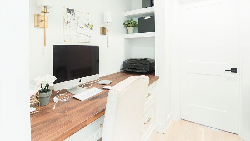
Hallway Office
Jessica and Mary-Michael designed a desk nook area in the hallway beyond the kitchen with assistance from Mary-Michael’s father-in-law who owns Henry County Hardwoods.
 Living Room
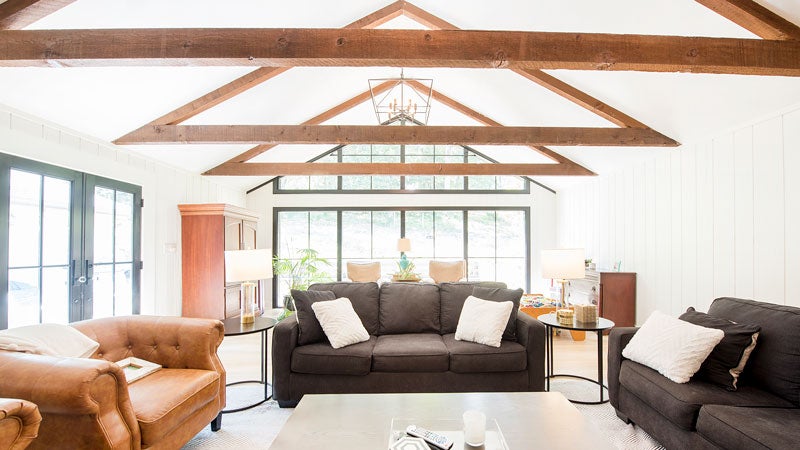
Mary-Michael built off the good bones of their large living space and made it more modern with light walls and dark couches. White built-in cabinets on either side of the fireplace round out the room’s symmetrical statement.
 Dining Room
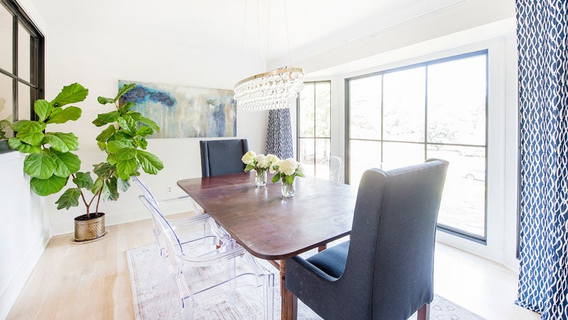
Mary-Michael’s style already shined in this room before renovations with an antique table, acrylic chairs flanked with navy upholstered ones from Target at either end. The glass orb light fixture adds a bit of funk to the room too.
Behind the Scenes
- Interior Design: Jessica Conner Design & Interiors
- Framer/Carpenter: Frank Troncore
- Electrician: Sammy Ruben/Master Electrician
- Tile: South Cypress
- Light Fixtures: Meyer Lighting
- Flooring & Molding: Henry Country Hardwoods, Superior Hardwood Flooring
- Exterior Doors: Southern Window Supply
- Interior Windows & Doors: Builders Millwork
- Countertops: CR Home Alabama
- Kitchen Rug: Hazel House Collective

