Stacy and Jerrod Allen weren’t looking to buy a house in the summer of 2011 when Stacy drove through Cahaba Heights to look at the damage from the home wrecker of a tornado that had come through on April 27. As she drove up Mountainside Drive, she saw house after house that had been demolished or at least still had a tree on top of it—but not a midcentury ranch on the right hand side. And it was for sale. So Stacy called up Jerrod and told him she wanted him to come look at it. His reaction? “Are you crazy?” But lo and behold they got a good deal on the home and sealed the deal in August.
Over next eight years, the street has street came back to life and thrived just as the aesthetic inside their home has. “It wasn’t necessarily modern at the time, but it had the midcentury ranch style I knew we could work with,” Stacy says. “We knew we could come in and finish out the inside to be modern, and it would make sense in this house.”
After all, a shared interest in modern design was part of what first drew Stacy to Jerrod. He’d been renovating a 600-square feet condo in Southside with a modern aesthetic when they first started dating. “It’s one of the things that really attracted me to him,” she says.
Over the years, Stacy, a photographer, and Jerrod, an industrial designer, have tackled one renovation project at a time in the home, acting as their own architect and interior designer with the minimalist Scandinavian style that inspires them. “I have the crazy ideas, and he figures out how to do them for cheap,” Stacy says.
And for them design isn’t just a private affair. “It’s a huge compliment when people see something we’ve done and do the same thing,” Stacy says, noting the reactions she gets from readers about their projects on her blog mtnsidehome.com. “I want people who like modern design to feel like they have access to it, and that it’s not just for the wealthy.”
This design philosophy the Allens hold to is perhaps best summed up in a quote from one of their favorite designers Ben Uyeda: “Design is a path to creating access to things we otherwise couldn’t afford.” And sometimes that access comes at a place and time you hadn’t expected either.
 Kitchen
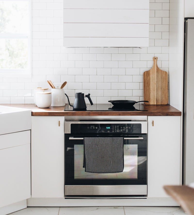
One of the first elements the Allens decided on for their kitchen renovation was walnut herringbone countertops, and lucky for them, Ikea had just added them to their product line at the time. Stacy wanted the space to be bright for photoshoots, so they selected white cabinets from Ikea with brass hardware they ordered from eBay and covered the floors in a 12-b-24-inch ceramic tile from Home Depot that resembles marble. Shiplap on the vent hood matches several walls in the kitchen and dining area—a design element the Allens used to add character to the box shapes in much of the house.
 Breakfast Bar
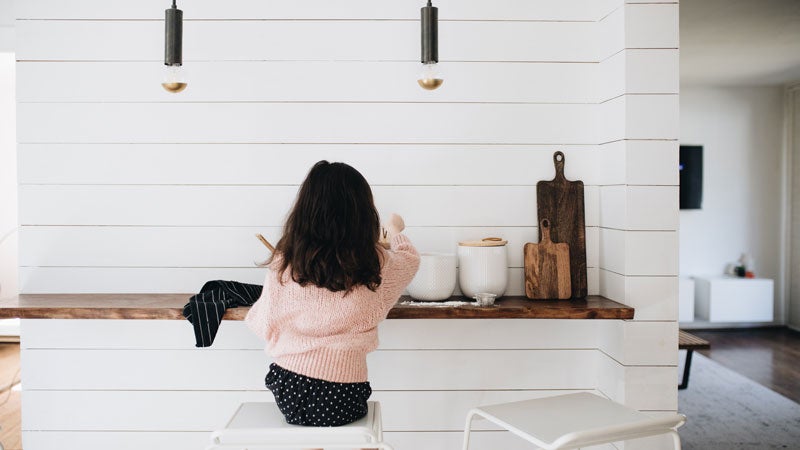
Jerrod found this piece of live edge walnut in the shop of the architecture firm where he was working at the time, and finished it off for this eating space. Above it hang pendant lights made in Oregon by Cedar & Moss, Stacy’s favorite lighting vendor.
 Office
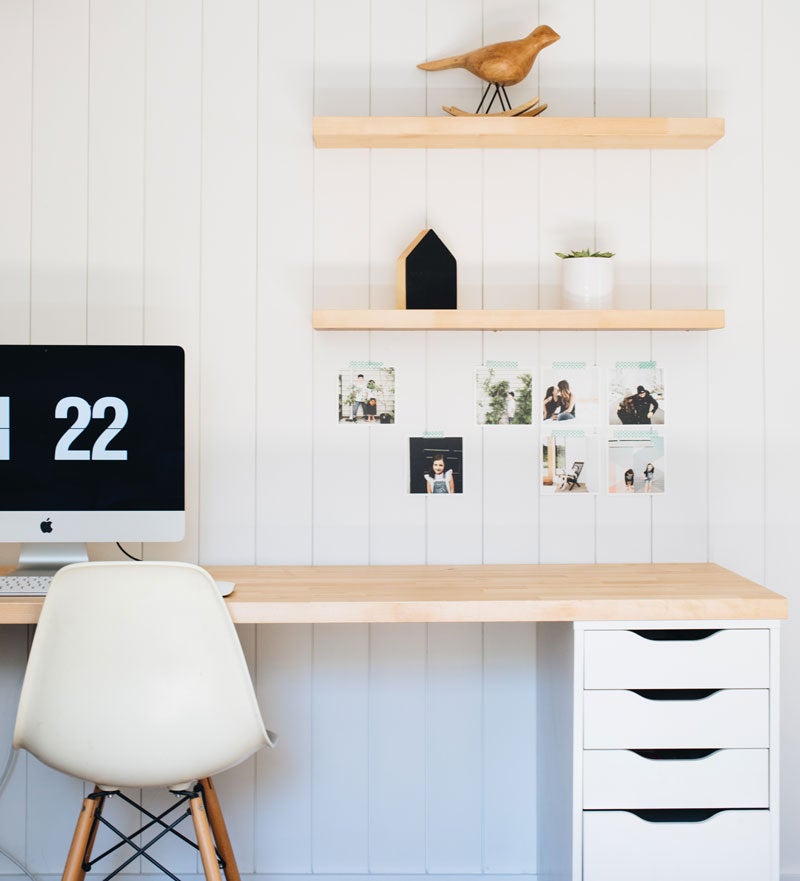
To make this space feel peaceful for Stacy when she works from home, she and Jerrod stripped down the previous wood paneling and brought in the same bright aesthetic from the rest of the house. “It’s important for me to have inspiring spaces to work in,” Stacy says. The floating shelves were made from cuts from the Ikea kitchen countertops used on desk and floating storage unit in the room.
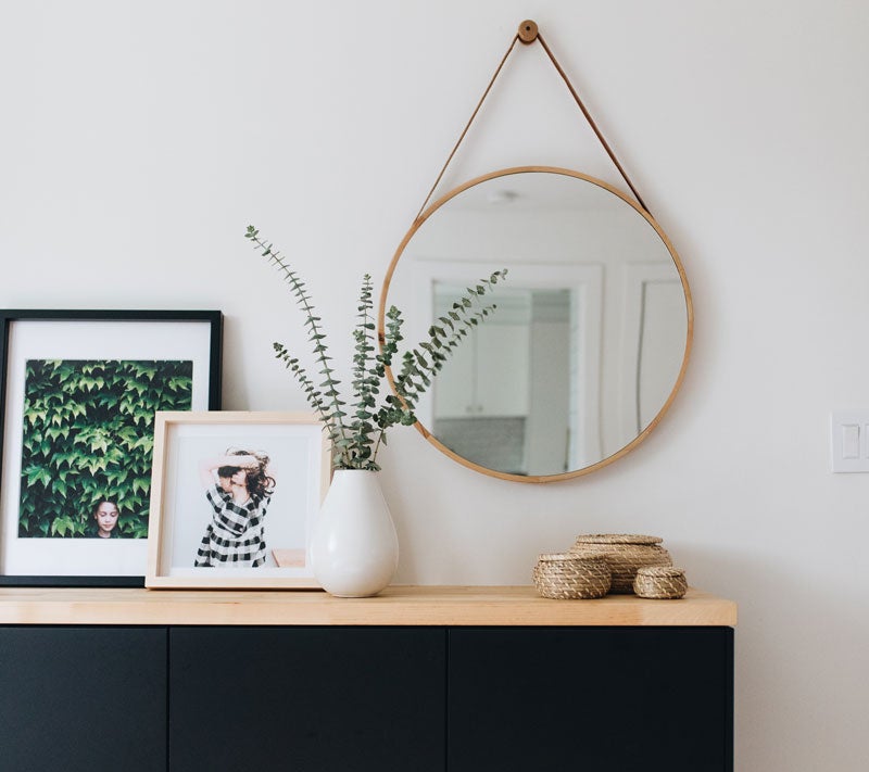 Office Cabinet Vignette
With an older home often comes uneven floors that make furniture look uneven too, so the Allens decided to hang this office storage area they fashioned from Ikea kitchen cabinets.
Stacy’s tutorial on this “Ikea cabinet hack” is one of the most popular posts on her blog. “(Ikea cabinets) are like Legos,” she says. “They are great building blocks to start with and make our own.” The frames sitting atop the cabinets are from a collaboration Stacy did with Artifact Uprising and showcase her photography.
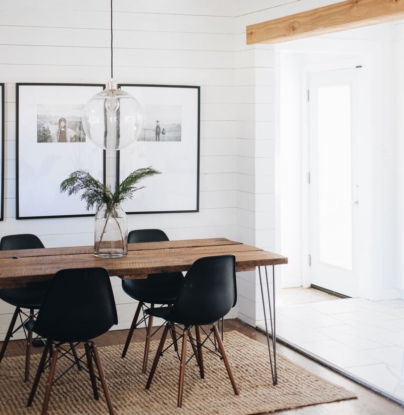 Dining Room
Stacy wanted a table with hairpin legs, so Jerrod made this table with reclaimed wood from Evolutia. Behind it hangs a gallery wall Stacy made with Ikea frames with custom mattes for a fraction of the price of a similar set she’d seen from an online framer. Each black frame displays a different picture from a camping trip the family took to Rocky Mountain National Park in 2017.
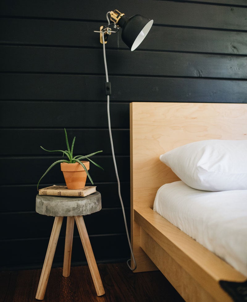 Boy’s Room
The Allens’ son Jude wanted a “cool room too,” and Stacy had been wanting to put black shiplap on a wall and decided to make it his Christmas present. Jerrod was too busy at work at the time to do it, so he brought home the wood and Stacy installed and painted all the shiplap herself and Jarrod’s dad Tim helped make the cuts. To the left of the bed sits a stool Jerrod and Jude made using only concrete, a bucket and dowels based on a tutorial from one of their favorite designers Ben Uyeda.
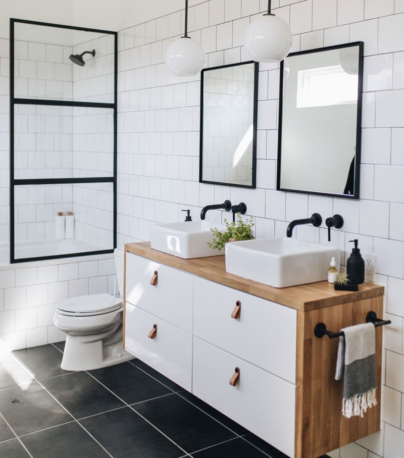 Master Bathroom
The Allens added this space onto the back of their master bedroom. “If we were to start from scratch, that’s what our spaces would look like with the high ceilings and all the natural light,” Stacy says. After years of sharing one bathroom with four people, they were sure to add his and hers sinks on top of Ikea cabinets with leather pulls.
As to the shower, Stacy had seen a black frame shower wall like this one on modern design blogs, and Jerrod worked with a welder, powder coater and glass company to create their own version for a much lower price
Behind the Scenes
- Office & Breakfast Bar Lighting: Cedar & Moss
- Office Paint: Sherwin-Williams Alabaster White
- Kitchen Cabinets: IKEA Sektion in Vettige White
- Office Storage: Ikea Sektion Cabinets in KUNGSBACKA
- Bathroom Lighting and Pendant Over Kitchen Sink: West Elm
- Kitchen Faucet: Delta Trinsic in Brilliance Champagne Bronze
- Office Artwork: Amee Calloway Art

