The walls of the contemporary behemoth at the top of VesClub Place could tell many stories of lavish parties and laughter. The gravel and cement-lined backyard boasted a sign that listed rates per hour for parking. Upon entering the house, you were greeted by a coat check counter with a true coat check closet behind it. Behind it was a spiral staircase leading up to a bedroom, perhaps for a service staff member. “It’s very interesting,” Beth Pierpoint of Oak Property Solutions says of how they found the house when they purchased it to renovate and resell in 2016. “We kept thinking, ‘What in the world? Why is this here?’”
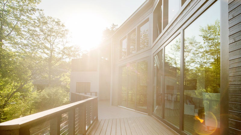
The nearly 7,000-square-foot tri-level home was built in 1987 with a design reportedly by I.M. Pei, an internationally renowned architect who also designed Kirkwood Clinic locally as well as the Kennedy Library, John Hancock Tower in Boston, and Javits Convention Center in New York City, among other notable projects. Right here in Vestavia, though, this home’s expansive walls of windows offer views of the hills beyond are that nothing short of spectacular, similar to what you can see from Vestavia Country Club.
The house’s master bedroom, which boasts a particularly stunning panorama from its balcony, is particularly massive, like 560 square feet massive, and its bathroom is just as big. The centerpiece of the original bath was a massive Jacuzzi tub mounted up on a platform surrounded by mirrors, all tiled in black and white stripes that could give you vertigo. “I was not sure about that bathroom, other than it was a direct throwback of the ‘80s,” Beth says. “It was very grand and odd at the same time.”
 Also a bit surprising, the home’s foundation was built more like Fort Knox. An engineering report stated it could support a commercial building, and was supported with massive steel beams and cement. For all of the damage that was repaired above the foundation, the foundation itself was in nearly pristine condition. “This is amazing since there is a concrete channel designed to transport water from the hills under and around the home,” Beth says. “Numerous inspectors have reviewed the foundation and this channel and have stated that it is doing exactly what it was designed to do, get water out fast and protect the structure.”
A West Coast native, Beth was drawn to the house’s contemporary architecture that reminded her of home when she saw it at an auction in March 2016. At the time, it had been abandoned for years and was overgrown with plants to the point where it developed a reputation as the “scary house on the hill.”
The original idea for the renovation was to repair the damage, move some things around and redo plumbing, electrical work and sheet rock, but in the end the team replaced most of the framing, windows and siding. So they decided to move the some walls and relocate the kitchen while they were at it. The original master bathroom Jacuzzi tub and the coat check areas are now no more, making way for a more traditional elegant bathroom suite upstairs and a powder room downstairs.
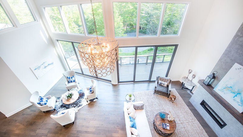
The design goal was to mix contemporary elements with one more traditional ones. They also moved the kitchen from a small enclosed space in the back of the home to an open area adjacent to the living room. To call that main living area spacious would be a vast understatement. Its ceilings stand 21 feet tall, the living space itself is a massive 665 square feet. Most ceilings in the home are 10-12 feet high.
Likewise, Beth thinks the home will appeal to a buyer who favors the arts and might want to transform the expansive walls into a gallery of sorts. She also, of course, envisions the future owner being someone who enjoys entertaining, just as the previous owners did, with the newly open floorplan fostering a more elegant entertaining lifestyle. Plus, 12-foot sliding glass doors open up to the massive front deck from the main living spaces, creating an even larger space for parties.
But the house’s biggest selling point is, of course, its positioning at just the right vantage point. “The views are amazing, especially at night and first thing in the morning,” Beth says. “It’s incredible.”
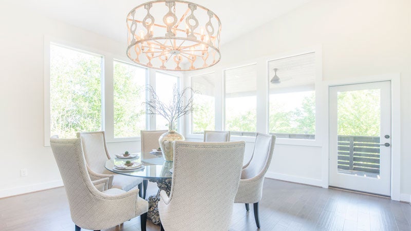 Dining Room
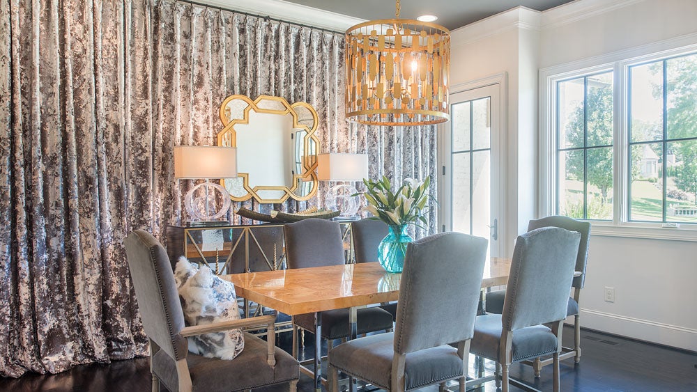
Beth Pierpoint isn’t sure what the original purpose of this space on the far right side of the house was, but she decided its six-window view made for an amazing dining room. It has its own deck as well. “It’s cool when it’s sunny, it’s cool when it’s rainy, it’s cool when a storm is coming in,” Beth says of the view.
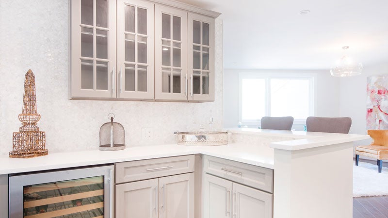 Bar
Bar
A wine room and bar are located between the kitchen and dining room.
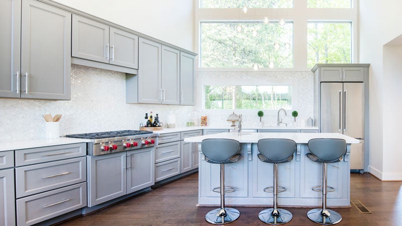 Kitchen
The kitchen was moved to this open space to make it ideal for entertaining and offer a view of the backyard greenery. Its Orion fixture adds a modern flair to the space, and its backsplash tile is an elegant Thassos marble and mother of pearl. Like the other surfaces on countertops, the kitchen has a quartz stone.
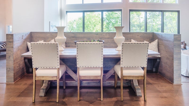 Eating Nook
It feels a bit funny to call this a breakfast nook with its long farm-style table and built-in banquet with a gray wash, but it is located right off the kitchen a few steps up from the living room.
 Living Room
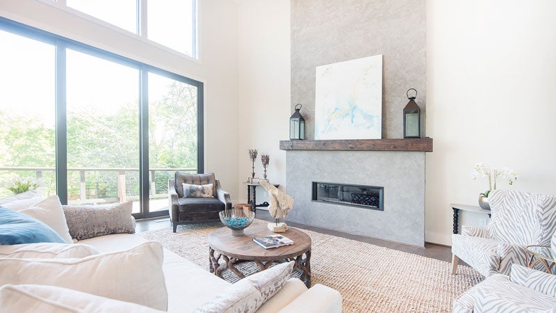
Three sets of sliding glass doors provide views of nature around that make you forget the house has neighbors at all. In the renovations, the fireplace was moved from the middle of the room to one wall, but the Italian lime marble with a mortar-type wash standing from floor to ceiling 21 feet high still certainly makes a statement.
Monica Kelley staged the home decor for potential buyers, highlighting its architectural features and using a neutral palette with pops of color. This space is accented with wall art by local artist Carrie Pittman.
Sitting Area
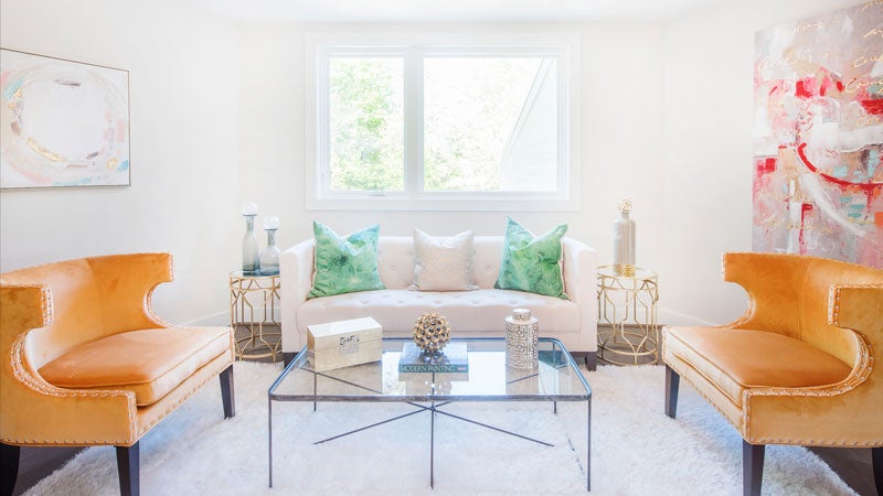
Monica Kelley styled this area between the bar and the dining room with a retro feel and bold accents like green pillows hand painted by local artist Carrie Pittman.
 Master Bedroom
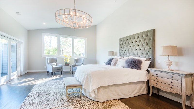
Beth and her team joke that you could easily put two king sized beds in this room or a nursey on one side. It’s that big. Originally the room featured a loft where you could see over the bedroom area, but they had it removed.
 Master Bathroom
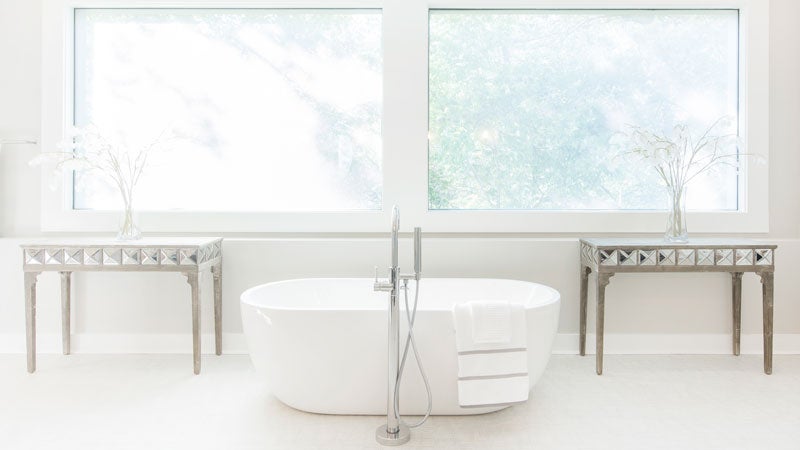
This space was reconfigured to offer his and hers toilets and a his and hers shower, as well as bathtub and grass cloth floor tile that is textured to look like fabric. The window behind the tub holds honeycomb between sheets of glass. From the outside, the windows look gold and you can’t see in, so you don’t need shades or blinds. UAB had actually purchased the window from Dubai and was looking to sell it when they were demolishing a building.
Meet the Team
- Investors: Cherie Miner & Beth Pierpoint, Oak Property Solutions LLC
- Architect: Cherri Pitts, Studio C Architecture & Interiors
- Contractors: Tommy Prewitt Construction & CSG, LLC
- Staging and Interior Design: Monica Kelley, Monica Kelley Staging and Interior Design
- Select Art: Carrie Pittman, Carrie Pittman Art
- Lighting Designer: Terri Phillips, Light It Up
- Select Lighting: Ella Home, Inline Electric
- Flooring: Andrew and Rachel Turman, Turman Design Company
- Plumbing Fixtures: Shelby Blalock, Fixtures and Finishes
- Tile Flooring & Decor: Stephanie Harwell, Issis & Sons
- Cabinets: Pelham-Oak Mountain Cabinets
- Appliances: AllSouth Appliances
- Electrician: Darryl Guarino, Power Up Electric, LLC
- Plumbing: Greg Blackman, Blackman Plumbing
- Tile Installation: Victor Salas, George Gustin Tile
- Concrete: David Champion, C and C Masonry of Central Alabama, LLC
- Custom Concrete: Ellis Hopkins, Hopkins Flooring, LLC
- Italian Marble Plaster: Beth Pierpoint, Oak Property Solutions, LLC
- Landscaping: John Saunders, Nature’s Edge Landscaping
- Closets and Shower Doors: Farry Dawson, Birmingham Construction Specialties
- AV and Security Wiring: Andy Evans, Switch Audio Video
- Listing Agent: Jeff Newman, ERA – King

